Medicare Seminar Marketing
As art director and designer for Health First, I was responsible for managing and growing their brand. Certain graphic elements, fonts, colors and imagery were always consistent. The challenge was to use those elements and create something fresh and new. I also worked with my writer to concept and art direct their cable spots.
HEALTH FIRST BRAND ADS
Brand ads are always cleaner than seminar ads. They allow for negative space and room for the ad breath.
HEALTH FIRST SEMINAR ADS
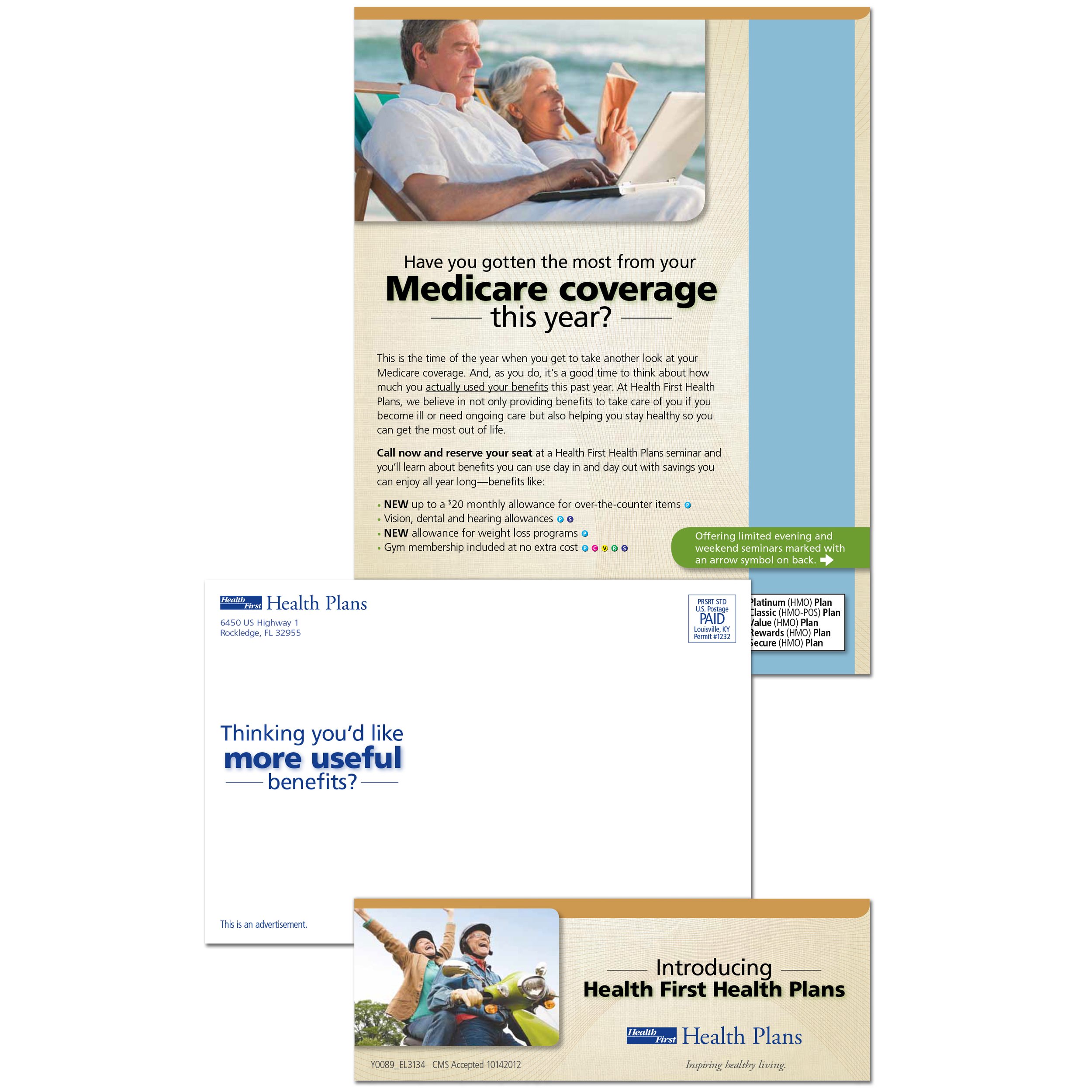
Medicare seminar ads legally require a minimum 12 pt font size to insure that seniors are able to read the ads comfortably. This is always a challenge for the disclaimer copy. It’s not easy to create negative space in medicare seminar ads. You have to take elements and words away until it hurts. That’s how you get the cleanest ad possible.
-
![]()
Brand Ad
-
![]()
Brand Ad
-
![]()
Seminar Ads
-
![]()
Letter Package
-
![]()
Postcards
-
![]()
Postcards